Tuesday, May 7, 2013

G I F . I S . I T


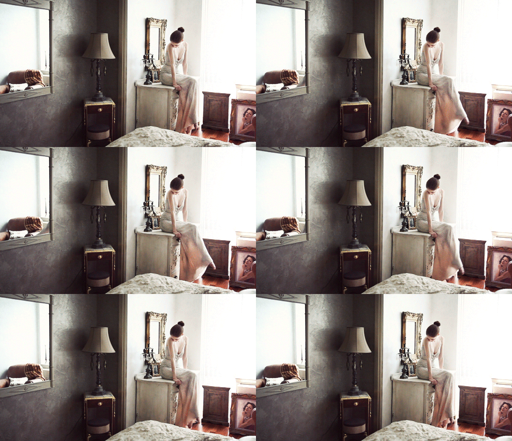
Speaking of cultures intertwining in an earlier (The Eurasian Effect) with one another, here's another "hybrid" in a media format. The marriage of still images with moving ones has given birth to gifs. A format of where is neither a photograph nor video, at least that is what I make of it. According to the proper definition, GIF stands for Graphics Interchange Format which essentially is bitmap image format so technically I was wrong when saying it wasn't a photograph as it in fact an "image". Anyway, over the past year or so, this format has become quite popular on the Internet and photographers are taking this opportunity to innovate their folio and abilities to make the short jump into non-still format media. What do you guys think if this? I personally like it. I find the process of making (taking) one is interesting and I am seriously considering adding this to my final year folio project.



A.B


T H E .E U R A S I A N . E F F E C T


Signe Vilstrip photographed Gertrud Hegelund for this Indian-inspired shoot for French Revue #22. The cross cultural influences within this series of images is becoming a soft trend going around the fashion world the past couple of years. Another series of images ended up in an editorial piece (below) in Style Singapore magazine, photographed by local photographer Alvin Kean Wong. Some disagree with this cross cultural theme. Personally, I think it's fine because Globalisation is happening around us. Cultures are becoming more intertwined with one another. East is meeting the West and they're gelling well together. It's only natural for the fashion world to similar to this. I absolutely would love to execute a high-fashion shoot of this theme. It definitely exudes luxury in highest detail. The jewellery and the colours used are beautiful.  


A.B

Supermodels Enter Rehab


Models: Agyness Deyn, Denisa Dvorakova, Guinevere van Seenus, Irina Kulikova, Iselin Steiro, Lara Stone, Masha Tyelna, Missy Rayder, Sasha Pivovarova and Tasha Tilberg
Photographer: Steven Meisel

This editorial spread titled, "Supermodels Enter Rehab" was published in Vogue Italia June 2007. Photographed by the genius and ever controversial, Steven Meisel, who yet again manages to create a very questionable series of photographs. Brilliant work, no doubt but questionable, yes.

This series was rumoured to reference the madness that visited Britney Spears around the same time. The crotch shots and shaved heads are definitely a nod to Britney as inspiration for the editorial, considering how the spread was also shot in paparazzi style.

I love how the photographs have also been given a treatment where they appear to be more of sickly sallow colours like green and yellow. Greens and yellows are often associated with sickness, disease and illnesses. This correlates with the location and theme for the photo spread. 

Apart from all the beauty in the photographs, I am sure that I would not be the only one to say that there is something quite disturbing about "beautifying" mental illness and rehab. Not that these topics do not deserve to be viewed in a more positive light but somehow, I do not agree with having the social ill reduced to a few photographs of beautiful people in beautiful clothes running around a "beautiful" location. Needless to say, impressionable people will be easily influenced by such photos in the wrong way.

What do you guys think about this? Screwed up, I'll say.


Do You Read What You See?


They look like any run of the mill ads, don't they? Nothing very fancy or outstanding?
Read again. You'll be surprised to see what's there.

Ad agency, DDB Paris, created a series of sly print ads for the Fight for Literacy foundation. These ads are not all what they seem and enlighten those who do a double take and pay attention.

At first glance, the satirical print ads seem like ordinary ads that are there to promote products, such as a mascara, car, bikini and computer. However when carefully looked at and read, viewers would realize it's actually a French literacy campaign.

I thought this was another brilliant campaign for a good cause. It speaks so much about human nature and how important first impressions are to us. It also tests the average viewer to be observant about their surroundings and actually understand what they are looking at. Ads like these are revolutionary for they are 'thinking ads.'


Note: All ads above were translated into English.

K N I G H T L E Y . A B U S E


In a follow up to Chareli's post on abuse campaign. Directed by Joe Wright, this two-minute ad campaign about domestic violence for the charity Women's Aid stars Keira Knightly as an abuse victim. The ad opens with her arriving home and when she does, she gets abused physically and verbally by her partner, who accuses her of being unfaithful. The ad ends with Knightley screaming due the abuse and with the tagline,  "Isn't it time someone called cut?".

"I wanted to take part in this advert for Women's Aid because while domestic violence exists in every section of society we rarely hear about it," said Knightley. "Domestic violence affects one in four women at some point in their lifetime and kills two women every week."
Grey London, an ad agency, produced this ad with Knightley and Wright, who also directed Knightley in her glamorous Coco Chanel Mademoiselle ad, donating their time and talent.
"In 2007, the agency created a shocking and much-publicised press and poster campaign for Women's Aid featuring celebrities including Jemma Kidd, Fiona Bruce and Anna Friel made-up to look as if their faces were covered in bruises from domestic violence."

B A M B I . N O T . T H E . R E I N D E E R


American photographer Dove Shore photographed Bambi Northwood-Blyth for Foam magazine May 2013 issue. Photographically, I'm inspired by colours and whether it may be fabrics or lights. I find this editorial spread very interesting and close to what I am inspired to create in my folio. Personally I think using mirrors is clever and easy way to make a photo look dynamic and "busy" to continuously attract the viewers' eye here and there. Using the reflective surface can also create a 2-in-1 image, one- the actual subject, two-the subject's reflection. I don't know how to explain in a proper sentence structure but just look at how the photographer captures the model and her reflection together, as if there were two of them. I find that pretty interesting and I am planning to use that in my future shoots. 

A.B

Smoking Kids by Frieke Jannsens

IMAGE ANALYSIS


Smoking Kids is a series by Frieke Janssens. Frieke Janssens was inspired by YouTube video of a chain smoking Indonesian toddler. The video highlighted the cultural differences between the east and west, and questioned notions of smoking being a normal adult activity. I think this image is a social commentary on the issue of smoking itself regardless the age and gender. Frieke Janssens intention is to isolate the viewer’s focus upon the issue of smoking itself. It would not have a surreal impact upon the viewer if the subject matter weren’t kids. Therefore, they could truly see the acts of smoking rather than making assumptions about the person doing the act.

The kids are different in ethnicity, race and facial features. They are different in hair and skin color. Frieke Janssens also give each of the kids a unique character. It’s almost feel like all of them are real individuals. There are girls who are very girly, boyish, Madame-like. It’s also apparent in the boys. In my opinion, these kids were styled in nostalgic vintage clothes to create an old-fashioned era. However, It’s interesting that they were dressed in adult’s attires. This highly stylized adult-like looks is to emphasize the juxtaposition between the styling and the fact that they are children.

The culture of smoking has a retro feel, like the time period of 90’s movies. The kids look oddly convincing mimicking smokers’ casual postures as they blow smoke from their noses and flick out their wrists. They imitate various kind of stances on taking a puff of his/her cigar. The most notorious kind is blowing smoke rings, which considered cool by some parties. Also, There are different ways of smoking-style portrayed in this series. For example, cigarette holder like Audrey Hepburn, pipe smoker, the usage of zippo, and etc.

These series undeniably raises reactions on the viewer’s. It raises an issue of the unhealthy, destructive, and harmful effect of smoking. I strongly believed, it wouldn’t have been so provocative and controversial if the subject matter weren’t kids. Otherwise, This series wouldn’t have had much attention and discussion. This series has caused people to stop and reflect the effect of smoking why it’s socially acceptable for adult to smoke, but why is it inappropriate for kids to do the exact act. Imagine, you are giving a kid one roll of cigarette, it’s an immoral act. However, it’s very normal for adult to share and give their cigarettes among friends or even strangers. This has brought me to a conclusion that us human is a creature that constantly judging what’s socially acceptable, appropriate, and ethical regardless our standards of behavior or beliefs concerning what is and is not acceptable for them to do.

Do Janssens' photographs drawn a critical view on smoking in contemporary culture or are these photographs inevitably controversial? Whether portraying children with cigarettes or adults taking their final portraits before dying, Janssens is interested in taking a deeper look into society norms. “Smoking Kids” is one among all of her great works. She has successfully done a great job on this series from the styling, posing, the sitters wise, the colors are all well constructed.

Monday, May 6, 2013

K I D S . I N . P A R I S


Photographed by Sharif Hamza for Paris Vogue December-January 2011 issue, it features VERY young child models - Lea, Prune and Thylane, as part of the "Cadeaux" editorial. They were styled by Melanie Hyunh, dressed in luxurious and expensive designer gowns matched with shiny bing-a-ring jewellery and they wore more make-up than the average model editorial model would use. 

Looking at the photos at first, I couldn't help but notice the lighting technique and I judged it aesthetically. It looks rich, luxurious, expensive BUT dead wrong! Well at least that's what most people think. Personally, aesthetically it's not wrong or gross but ethically using children and placing them in a setting like this of a high fashion-almost-couture like set, raises a moral issue.

I find it a tad below disgusting but it's Vogue Paris. They're always provocative so I guess this is normal to them, innovative for being one of the first, if not the first, to use children as fashion models in it's campaign. Kudos to Hamza too for executing the innovative concept.

A.B